Curvilinear Regression
Objectives
How does polynomial regression test for quadratic and cubic trends?
What are orthogonal polynomials? When can they be used? Describe an advantage of using orthogonal polynomials to simple polynomial regression.
Suppose we have one IV and we analyze this IV twice, once through linear regression and once as a categorical variable. What does the test for the difference in variance accounted for between these two tell us? What doesn't it tell us, that is, if the result is significant, what is left to do?
Why is collinearity likely to be a problem in using polynomial regression?
Describe the sequence of tests used to model curves in polynomial regression.
How do you model interactions of continuous variables with regression?
What is the difference between a moderator and a mediator?
Materials
Linear vs. Nonlinear Models
The linear regression model has a form like this:
Y' = a+b1X1 + b2X2.
With models of this sort, the predicted value (Y') is a line, a plane or a hyperplane, depending on how many independent variables we have. It's a line with 1 IV, a plane with 2 IVs, and a hyperplane with 3 or more IVs.
The kinds of nonlinear models we deal with in regression are transformations of the IVs. For example, we might have models such as
Y' = a + b1X1+ b2X12 + b3X2
Or
Y' = a + b1Log(X1).
Typically, we do not have models like this:
Y' = a + b12X1+b23X2
Note that in the last case, the coefficients (b weights) are taken to a power, rather than transforming the independent variables. With transformations of IVs, we can use ordinary least squares techniques to estimate the parameters. The other kinds of models generally cannot be estimated with least squares.
Curvilinear Regression
When we have nonlinear relations, we often assume an intrinsically linear model (one with transformations of the IVs) and then we fit data to the model using polynomial regression. That is, we employ some models that use regression to fit curves instead of straight lines. The technique is known as curvilinear regression analysis. To use curvilinear regression analysis, we test several polynomial regression equations. Polynomial equations are formed by taking our independent variable to successive powers. For example, we could have
|
Y' = a + b1X1 |
Linear |
|
Y' = a + b1X1 + b2X12 |
Quadratic |
|
Y' = a + b1X1 + b2X12+ b3 X13 |
Cubic |
In general, the polynomial equation is referred to by its degree, which is the number of the largest exponent. In the above table, the linear equation is a polynomial equation of the first degree, the quadratic is of the second degree, the cubic is of the third degree, and so on.
The function of the power terms is to introduce bends into the regression line. With simple linear regression, the regression line is straight. With the addition of the quadratic term, we can introduce or model one bend. With the addition of the cubic term, we can model two bends, and so forth.
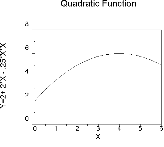
An example of a quadratic function:
Note that the graph has one bend. The same function could fit data where the slope of the regression line becomes less steep as X increases, but the line does not actually begin to descend, as it does in the above graph.
That is, we can fit data with an asymptote or ceiling effect using the quadratic equation.
The cubic graph shows two bends.

Both graphs show the relations of a single independent variable with Y. In multiple regression, of course, multiple variables have relations with Y, and any can be represented by a straight line, or not.
With 2 variables that both have linear relations to the criterion, the response surface is a plane. It might look like this:
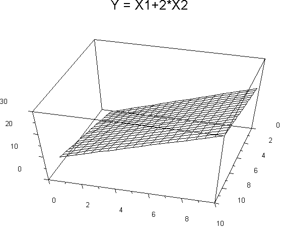
Or this:
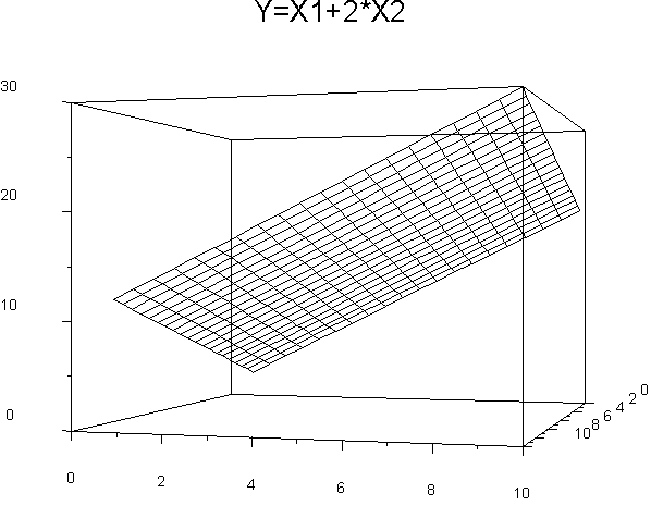
These are two different views of the same response surface, a plane formed by the two regression lines. The equation is the same for both, namely, Y' = X1+2X2.
In our second graph, X2 is most nearly horizontal across the page, while X1 goes back into the page as it were. Y is represented by height in the graph. The slope for each variable is represented by the steepness of the graph. Nonlinear relations will be indicated by systematic departures from the surface of the plane. For example:
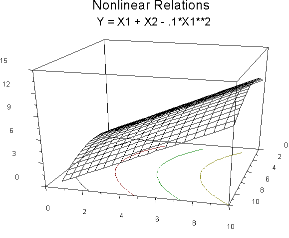
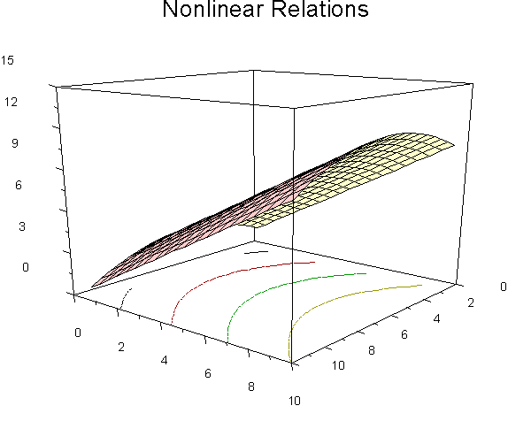
In this graph, X1 (going back into the page) has nonlinear relations with Y. Note the contours on the floor of the figure. The contours indicated equal values of Y, much like a topographical map. The actual surface of the graph is like a section of a coffee can. X2 (horizontal axis along the width of the page) has linear relations with Y. The equation: Y' = X1 + X2 - .1*X12. Another angle to look at the same relations:
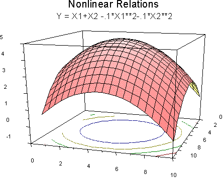
Of course, we can have nonlinear relations with both X variables. For example,
We can imagine what happens with 3 or more independent variables, but it is difficult to graph.
Testing for Nonlinear Trends
in Experimental Research
Comparing Linear to Categorical Sums of Squares
Linear regression assumes that a straight line properly represents the relations between each IV and the DV. In general, you should graph your data to see if this seems to be the case. Of course, this amounts to an interoccular test of linearity, and lots of people want something a little more objective in the way of a test. If we have categorical IVs, we can check the assumption of linearity by comparing the sum of squares due to linear regression to the sum of squares between groups (accounted for by group differences without the restriction of being linearly related to the IV). If the two sums of squares are the same (not significantly different), we conclude that the assumption of linearity is satisfied. If SSB is larger than SSreg, we conclude that nonlinear relations are present.
For example, suppose we wandered over to Busch Gardens and interviewed people about their experience of riding a roller coaster. We ask them how exciting the coaster was on a scale of 1 to 10 (1 being a yawner and 10 being sockless; this is the DV). Our IV is time from riding the coaster to being asked about it. We interview people immediately after, 5 minutes after, 10 minutes after, and 15 minutes after. Our fictitious data look like this (we would collect lots more people with a reliable and valid scale if it were for real):
|
|
|
Dummy Code |
|
||
|
Rating (DV) |
Time (Contin. IV) |
V1 |
V2 |
V3 |
|
|
10 |
0 |
1 |
0 |
0 |
|
|
9 |
0 |
1 |
0 |
0 |
|
|
10 |
0 |
1 |
0 |
0 |
|
|
8 |
0 |
1 |
0 |
0 |
M=9.2 |
|
9 |
0 |
1 |
0 |
0 |
S=.84 |
|
8 |
5 |
0 |
1 |
0 |
|
|
7 |
5 |
0 |
1 |
0 |
|
|
7 |
5 |
0 |
1 |
0 |
|
|
8 |
5 |
0 |
1 |
0 |
M=7.8 |
|
9 |
5 |
0 |
1 |
0 |
S=.84 |
|
7 |
10 |
0 |
0 |
1 |
|
|
6 |
10 |
0 |
0 |
1 |
|
|
8 |
10 |
0 |
0 |
1 |
|
|
5 |
10 |
0 |
0 |
1 |
M=6.6 |
|
7 |
10 |
0 |
0 |
1 |
S=1.14 |
|
5 |
15 |
0 |
0 |
0 |
|
|
6 |
15 |
0 |
0 |
0 |
|
|
7 |
15 |
0 |
0 |
0 |
|
|
7 |
15 |
0 |
0 |
0 |
M=6.6 |
|
8 |
15 |
0 |
0 |
0 |
S=1.14 |
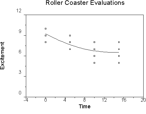
We can graph our data using a plot routine, like this:
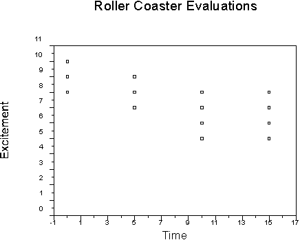
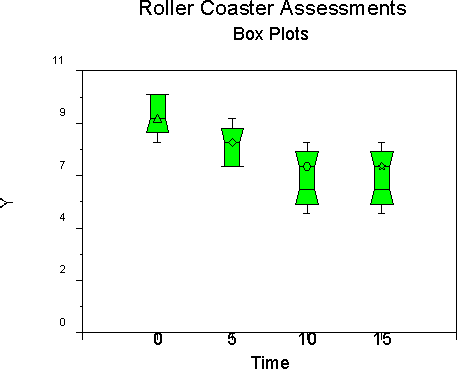
We can also use another routine, such as boxplots, to represent our data:
I use graphics from a package called Statmost because I can insert them easily into these materials for you. You can use SAS proc GPLOT and SPLOT to produce similar graphs.
To get side-by-side boxplots from SAS, sort the data by the IV and then run Univariate by the IV for the DV with the PLOT command. The last plot will be the side-by-side graph. In our example, I would say
PROC SORT; BY TIME;
PROC UNIVARIATE PLOT; VAR RATING; BY TIME;
Both graphs show that the ratings of the excitement of the roller coaster diminish over time, but that a lower asymptote (floor) appears at around 10 minutes. This suggests a nonlinear trend that we can test.
If we analyze these data with linear regression, we find that R2= .519897, F= 19.49, and the regression equation is Excitement' = 8.90 - .18(Time). If we now compute regression treating time as a categorical variable, we find that R2 is .5892. To test whether the increase from .52 to .59 is significant, we compute the significance of the difference between two R-square values:
The way I remember this kind of formula is to note that the first R2 is always larger than the second (if it weren't we wouldn't bother to test the difference). I remember the first, larger R2 as R2L and the second, smaller R2 as R2S. Then the formula becomes:
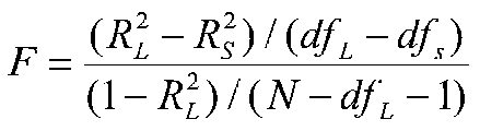
in our example, we have:
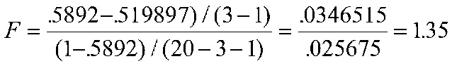
We can compare our observed F of 1.35 to the critical value of F with 2 and 16 df, which is 3.63 for the 5 percent level, so our result is not significant; the nonlinear trend is not accounting for a significant amount of variance. Suppose for a moment that the result were significant, and we had a nonlinear trend. The above test does not tell us what the nonlinear trend is. We have to do some additional work to find that out.
Testing for Trends and Modeling Nonlinear Relations with Orthogonal Polynomials
To answer questions about the form of nonlinear relations, we can fit data to power terms (and other functions), or we can use orthogonal polynomials. Orthogonal polynomials have this great property, that is, well, you guessed it, they are orthogonal, so they divide up the variance in Y in an unambiguous, easily interpretable way. Unfortunately, this is not true in ordinary polynomial regression with power terms, where the power terms may be highly correlated with one another.
To use orthogonal polynomials, you must meet two restrictive assumptions: (1) there are equal spacings between each "step" of the independent variable, and (2) there are equal numbers of people in each cell.
|
|
|
Orthogonal Poly |
|
||
|
Rating (DV) |
Time (Contin. IV) |
Lin 1 |
Quad2 |
Cub 3 |
|
|
10 |
0 |
-3 |
1 |
-1 |
|
|
9 |
0 |
-3 |
1 |
-1 |
|
|
10 |
0 |
-3 |
1 |
-1 |
|
|
8 |
0 |
-3 |
1 |
-1 |
M=9.2 |
|
9 |
0 |
-3 |
1 |
-1 |
S=.84 |
|
8 |
5 |
-1 |
-1 |
3 |
|
|
7 |
5 |
-1 |
-1 |
3 |
|
|
7 |
5 |
-1 |
-1 |
3 |
|
|
8 |
5 |
-1 |
-1 |
3 |
M=7.8 |
|
9 |
5 |
-1 |
-1 |
3 |
S=.84 |
|
7 |
10 |
1 |
-1 |
-3 |
|
|
6 |
10 |
1 |
-1 |
-3 |
|
|
8 |
10 |
1 |
-1 |
-3 |
|
|
5 |
10 |
1 |
-1 |
-3 |
M=6.6 |
|
7 |
10 |
1 |
-1 |
-3 |
S=1.14 |
|
5 |
15 |
3 |
1 |
1 |
|
|
6 |
15 |
3 |
1 |
1 |
|
|
7 |
15 |
3 |
1 |
1 |
|
|
7 |
15 |
3 |
1 |
1 |
M=6.6 |
|
8 |
15 |
3 |
1 |
1 |
S=1.14 |
Values of orthogonal polynomials can be found in the back of Pedhazur. A portion is reproduced below:
|
Polynomial |
X=1 |
2 |
3 |
4 |
|
Linear |
-1 |
0 |
1 |
|
|
Quadratic |
1 |
-2 |
1 |
|
|
|
|
|
|
|
|
Linear |
-3 |
-1 |
1 |
3 |
|
Quadratic |
1 |
-1 |
-1 |
1 |
|
Cubic |
-1 |
3 |
-3 |
1 |
To use the table, you have to note that the rows of the table correspond to what will be columns of data for analysis. That is, the first row is for the linear trend, the second row is for the quadratic trend, the third row is for the cubic, and so forth. The columns in the table are for the number of categories, levels or steps of the independent variable. You can only have as many trends as degrees of freedom, that is (levels-1). So if there are 3 levels of the IV, then you can test for two trends (linear and quadratic), and the codes you use are in the first two rows of numbers in the table. In our example, there are 4 levels of the IV and thus 3 trends are possible. Note how the numbers in the table correspond to IVs in the example. The correlations among the variables:
|
R |
Time |
Excite (Rating) |
L |
Q |
C |
|
Time |
1 |
|
|
|
|
|
Excite |
-.72 |
1 |
|
|
|
|
Linear |
1.00 |
-.72 |
1 |
|
|
|
Quad |
.00 |
.25 |
.00 |
1 |
|
|
Cubic |
.00 |
.08 |
.00 |
.00 |
1 |
Note that the linear IV (coded "linear") from the table of orthogonal polynomials correlates perfectly with the raw data coded under "time." Note also that the orthogonal polynomial vectors are uncorrelated with one another.
When we analyze the data, we find that R2 = .589217, which, interestingly enough, is identical to our R2 when we ran the problem as one with a categorical IV. Other results:
|
Source |
df |
Estimate |
Type I & Type III SS |
F |
P |
|
Intercept |
|
7.55 |
|
|
|
|
Linear |
1 |
-.45 |
20.25 |
20.25 |
.0004 |
|
Quad |
1 |
.35 |
2.45 |
2.45 |
.1371 |
|
Cubic |
1 |
.05 |
0.25 |
0.25 |
.6239 |
Note that our F tests using orthogonal polynomials are not equal to F tests we conducted earlier. The linear regression F was 19.49 instead of 20.25, and the quadratic F was 1.35 instead of 2.45. Although in this instance there is no difference in implications between the two analyses, the orthogonal polynomial analysis has more powerful tests because the error term is the residual R2 when all trends have been accounted for. That is, the error term used in constructing F tests is smaller in the orthogonal polynomial analysis.
Orthogonal polynomials allow one both to test for nonlinear trends and to model (that is, to write an equation and graph it) nonlinear relations in experimental data with equal "steps" and sample sizes. In other cases, we can test for trends and model nonlinear relations using polynomial regression.
Testing for Trends and Modeling Nonlinear Relations in Nonexperimental Research
To use polynomial regression, we compute vectors for power terms and include them in the regression equation. We then test them in sequence to determine whether adding bends to the equation improves fit. In our example, the data would look like this if we wanted to test for quadratic and cubic trends:
|
Rating (DV) |
Time |
Time**2 |
Time**3 |
|
10 |
0 |
0 |
0 |
|
9 |
0 |
0 |
0 |
|
10 |
0 |
0 |
0 |
|
8 |
0 |
0 |
0 |
|
9 |
0 |
0 |
0 |
|
8 |
5 |
25 |
125 |
|
7 |
5 |
25 |
125 |
|
7 |
5 |
25 |
125 |
|
8 |
5 |
25 |
125 |
|
9 |
5 |
25 |
125 |
|
7 |
10 |
100 |
1000 |
|
6 |
10 |
100 |
1000 |
|
8 |
10 |
100 |
1000 |
|
5 |
10 |
100 |
1000 |
|
7 |
10 |
100 |
1000 |
|
5 |
15 |
225 |
3375 |
|
6 |
15 |
225 |
3375 |
|
7 |
15 |
225 |
3375 |
|
7 |
15 |
225 |
3375 |
|
8 |
15 |
225 |
3375 |
The correlations among the variables:
|
|
Excite |
Time |
Time**2 |
Time**3 |
|
Excite |
1 |
|
|
|
|
Time |
-.72 |
1 |
|
|
|
Time**2 |
-.62 |
.96 |
1 |
|
|
Time**3 |
-.55 |
.91 |
.99 |
1 |
Note that the IVs are VERY highly correlated. We do not need diagnostics to tell us that collinearity is going to be a problem. What we do in polynomial regression is to conduct a sequence of tests. We start with Time, then add Time2 to see if that accounts for additional variance. If it does, we add Time3 to see if it adds variance. If it does, we could add Time4 if we wanted. We stop when adding a successive power term fails to add variance accounted for. With real data, it is rare to have a quadratic term add significant variance, and even more rare for a cubic term to add variance. In applied work, you will probably never need anything beyond the cubic. Results for our example:
|
Model |
Intercept |
b1 |
b2 |
b3 |
R2 |
R2 Ch |
|
1 Time |
8.90 |
-.18 |
|
|
.52 |
.52 |
|
2 Time, Time2 |
9.25 |
-.39 |
.014 |
|
.58 |
.06 |
|
3 Time, Time2, Time3 |
9.20 |
-.23 |
-.02 |
.001 |
.59 |
.01 |
In the first model (Time only), R2 is significant, and of course, so is the b for Time. In the second model, the b weight for Time is significant, but the b weight for Time2 is not.
This result is equivalent to testing the difference in R2 from .52 to .58 (R2 Change), which is not significant. In the third model, none of the b weights are significant, and the change in R2 from model 2 to model 3 is not significant. All three steps are shown here for illustrative purposes. In practice, we would stop after we found that R2 did not increase when we included the Time2 term. Incidentally, R2 for model 3 was .589217, which is the same as that we found for the categorical model and for the orthogonal polynomial analysis. What do you suppose would happen if we were to include a term for Time4?
Let's suppose for a minute that the quadratic term was significant, as it looks it might be based on the graph. Our regression equation is Y' = 9.25 -.39X + .014X2. Our graph would look like this:
Note how the curve follows the data in a way that is consistent with our intuition. If the quadratic trend were significant, we could claim that this graph was a better representation of the relations than the linear one. But it wasn't significant, so this is just for illustration.
Interpreting Weights
All of the vectors for a variable work together to produce the desired curve. For the last graph you saw, both X and X2 produce the curve. The weights cannot really be interpreted separately. Note also that if we subtract the mean of X from X, then the b weights will change. The increment in variance will not, nor will the graph of the curve. I mention this to underscore the point that you do not interpret the b weights for the variables when you include power terms. If you want to know the importance of a variable in the predicted or variance accounted for sense, then you need to compute the change in R2 between the model with the linear variable and all power terms absent to the model with the linear variable and all power terms present. They work together as a block, and need to be treated as such. Under no circumstances should you enter linear and power terms in a variable selection routine such as stepwise predictor selection. Such a practice can lead to nonsense such as concluding that a squared term contributes variance, but the linear term does not. Again, the linear term and associated power terms must be treated as a block.
If you want to know about the importance of the variable in an explanatory sense, it is very difficult to figure. It is hard to include nonlinear terms in path and structural equation models and to interpret them.
There is a literature on this, however, that you may read if you need to. Probably the interpretation of the importance of nonlinear relations is best tackled in the context of the particular problem in which you are working.
Computing and Interpreting Interactions
With two continuous variables, we can have an interaction. An interaction means that the level of one variable influences the effect ("importance") of the other variable. For example, it might be the case that creativity and intelligence interact to produce novel, useful mechanical devices (we might have people produce something and have it judged by a panel of experts). Suppose that the correlation between creativity and productivity gets larger as intelligence increases. For people with little intelligence, high creativity does not lead to useful devices (novel, perhaps, but useless as the transporter on the set of Star Trek for actually moving people). For people with high intelligence there is a strong correlation between creativity and productivity.
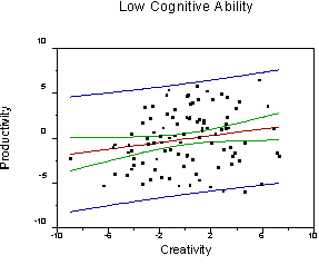
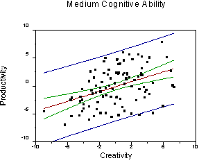
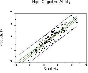
Note that the regression line for predicting productivity from creativity becomes steeper and the error of prediction is reduced as cognitive ability increases (r increases).
Such an interaction would be symmetric. For people with little creativity, there would be little or no correlation between intelligence and productivity. For people with high creativity, there would be a strong correlation between intelligence and productivity. We could create three new graphs to show these relations. All we would have to do is take the graphs we already make and to substitute the terms "creativity" and "cognitive ability." The relations would be the same (review the graphs to be sure you understand).
In regression terms, an interaction means that the level of one variable influences the slope of the other variable. We model interaction terms by computing a product vector (that is, we multiply the two IVs together to get a third variable), and then including this variable along with the other two in the regression equation. A graph of the hypothesized response surface:
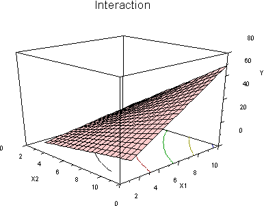
Note how the regression line of Y on X2 becomes steeper as we move up values of X1.
Also note the curved contour lines on the floor of the figure. This means that the regression surface is curved. From another angle:
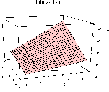
Here we can clearly see how the slopes become steeper as we move up values of both X variables. When we model an interaction with 2 (or more) IVs with regression, the test we conduct is essentially for this shape. There are many other shapes that we might think of as representing the idea of interaction (one variable influences the importance of the other), but these other shapes are not tested by the product term in regression (things are different for categorical variables and product terms; there we can support many different shapes).
Pedhazur's Views of the Interaction
In Pedhazur's view, it only makes sense to speak of interactions when (1) the IVs are orthogonal, and (2) the IVs are manipulated, so that one cannot influence the other.
In other words, Pedhazur only wants to talk about interactions in the context of highly controlled research, essentially when data are collected in an ANOVA design. He acknowledges that we can have interactions in nonexperimental research, but he wants to call them something else, like multiplicative effects. Nobody else seems to take this view. The effect is modeled identically both mathematically and statistically in experimental and nonexperimental research. True, they often mean something different, but that is true of experimental and nonexperimental designs generally. If we follow his reasoning for independent variables that do not interact, we might as well adopt the term 'main effect' for experimental designs and 'additive effect' for nonexperimental designs.
I don't understand his point about not having interactions when the IVs are correlated. Clearly we lose power to detect interactions when the IVs are correlated, but in my view, if we find them, they are interpreted just the same as when the IVs are orthogonal. But I may have missed something important here...he wrote the book.
Conducting Significance Tests for Interactions
The product term is created by multiplying the two vectors that contain the two IVs together. The product terms tend to be highly correlated with the original IVs. Most people recommend that we subtract the mean of the IV from the IV before we form the cross-product. This will reduce the size of the correlation between the IV and the cross product term, but leave the test for increase in R-square intact. It will, however, affect the b weights.
When you find a significant interaction, you must include the original variables and the interaction as a block, regardless of whether some of the IV terms are nonsignificant (unless all three are uncorrelated, an unlikely event). Therefore,
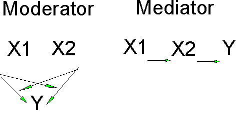
Moderators and Mediators
Some people talk about moderators and moderated regression. The moderator variable is one whose values influence the importance of another variable. An example would be that cognitive ability moderates the relations between creativity and productivity. Moderators mean the same thing as interactions. You test for moderators using the procedure I just outlined; this is moderated regression.
Mediators, however, are variables that receive the effects of one variable and pass the effects along to another. That is, the mediator is a conductor of indirect effects. For example, Schuler's theory states that Participation in Decision Making (PDM) by line (first level) workers increases Role Clarity and this leads to an increase Job Satisfaction. Role Clarity is a mediator in this case, because PDM does not directly affect job satisfaction, it does so indirectly through the mediator, Role Clarity. You analyze mediators through partial correlation or through path analysis or its grown-up sister, structural equation modeling. Some people graph mediators and moderators in different ways: