Regression Diagnostics
Questions
- • What is the linearity assumption? How can you tell if it seems met?
- • What is homoscedasticity (heteroscedasticity)? How can you tell if it’s a problem?
- • What is an outlier?
- • What is leverage?
- • What is a residual?
- • How can you use residuals in assuring that the regression model is a good representation of the data?
- • Why consider a standardized residual? What is a studentized residual?
- • What is collinearity? Why is it a problem?
- • How do you know if collinearity is a problem for your data? What can you do about it?
Concepts
When we use a model such as regression, we let an equation stand for our data. Doing so has advantages, but if the equation is a poor representation of our data, we may make mistakes in inferences such as inferences about our predictors and inferences about predictions based on the equation. Therefore, it is prudent to examine our data to spot problems, and if we find them, perhaps to take corrective action. Most of the tests of representation problems are not formal statistical tests. Rather, they rely on your good judgment and transparent reporting.
Linearity
Linear regression assumes that the relations between the dependent variable and the independent variable(s) are well represented by a straight line. To the degree that there are departures from linear relations, predictions that we make based on the results will be off, and we may also make mistakes in inference about the significance of relations between each independent variable and the dependent variable. If the relations are better described by a curve than a straight line, there are methods we can use to fit the curves (or other departures from linearity). Such methods are described in a separate module (curves and interactions). Although there are statistical tests for departures from linearity, the appropriate test depends upon the nature of the departure. Thus, always begin by plotting your data and examining the relations between the independent and dependent variables. To use the ordinary regression equation, a straight line should be a reasonable representation of the data by inspection of the plot.
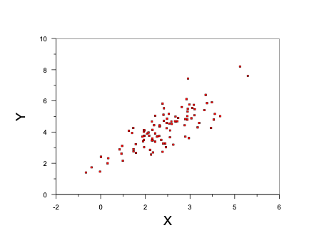
The following figure shows data that are well represented by a straight line.
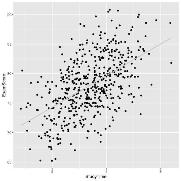
Notice how the average exam score increases as a smooth function of study time. An example of curvilinear relations is shown next.
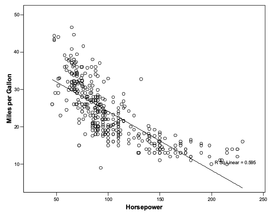
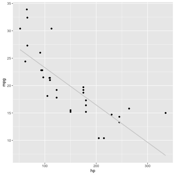
The graph shows the relations between horsepower of engines and gas mileage for a number of automobiles. The graph looks something like a crescent moon, so that a straight line under-predicts mpg at both low and high horsepower, but over-predicts mpg at moderate levels of horsepower. Essentially the same graph is shown below. I think the graph above was created by SPSS; I don’t remember the dataset. In the graph below, data were taken from the R dataset in the package Car (using different sample of automobiles, apparently).
Although it is possible to see the same pattern of results in the second graph as in the first, relations between variables become increasingly clear in graphs as the number of observations increases. If you had never seen the first graph, would you spot the curve in the second graph, or would you assume that the apparent departure was due to sampling error? As a rule of thumb, shoot for 250 to 500 observations for your regression. If you have less than about 100 observations, you will have a hard time reading the graphs properly (as well as statistical power problems for the analysis). Sometimes we simply cannot collect large samples of data, and in such cases, we do the best we can. Always plot your data.
Review
What is the linearity assumption? How can you tell if it seems met?
The linearity assumption is that the regression data are properly fit by a strait line. Plot your data to see if there are any clear departures for linearity.
Homoscedasticity vs. heteroscedasticity
The homoscedasticity assumption is that the variance of the residuals is constant across levels of the predictor(s). This is the same assumption as homogeneity of variance in analysis of variance, which is the assumption that the error variance is the same in all the cells of the design. This assumption allows us to use a single error term for every prediction (after accounting for distance from the mean; see the module on prediction). Similarly, in analysis of variance, the homogeneity of variance assumption means that we can use a single error term (assuming an orthogonal design) for post hoc tests of cell means and for significance tests of main effects and interactions.
If our data are multivariate normal, there will be more observations near the mean of both independent and dependent variables, so the range will typically be larger nearer the means. However, the variance will be the same across all levels if the relations between them are linear. Our first graph of exam scores by study time shows a multivariate normal pattern. If your graph looks like this, you may celebrate with chocolate, champaign, or whatever best suits your palate.
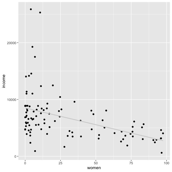
On the other hand, there may be a much larger variance of residuals at some levels of the independent variable than at others. If the dependent variable is money, you will often see a heteroscedastic plot. For example, the plot below shows some Canadian occupations’ average salary as a function of the percentage of women in the occupation (the Car package in R, dataset ‘Prestige’). As the percentage of women increases, the average income decreases, but the variance of the income also decreases. When the occupation contains mostly men, the variance is much larger. Such a graph indicates heteroscedasticity.
If we were to plot the sold prices of houses as a function of square footage, we would see a pattern in which the larger houses tend to show greater sold price on average, but there would also be greater variation in sold prices as square footage increases. We would expect something like the following graph, where X is square feet and Y is price.
Homoscedasticity is not important for point predictions on average. If linearity holds, then our best point prediction is always the on the regression line. However, the confidence interval and prediction interval for the point prediction will hold only if homoscedasticity is present. If heteroscedasticity is present, then the intervals must account for the specific values of the predictor. So, for example, the standard error in house prices is much larger for big houses than for small houses, and the standard error for occupational salary is much greater for occupations in which there is a smaller percentage of women (at least in the data in our above graph).
Review
What is homoscedasticity (heteroscedasticity)? How can you tell if it’s a problem?.
Homoscedasticity refers to equality of variance in the dependent variable at all levels of the independent variable; heteroscedasticity is the absence of such equality – the variance of error changes over values of the predictor. The terms properly refer to the population of interest; we expect some deviations from linearity and homoscedasticity in our samples.
Outliers
An outlier is a deviant or extreme data point. Outliers sometimes have a heavy influence on the placement of the regression line, and may even cause the line to misrepresent the bulk of the data. Thus, it is important to examine the data for the presence of outliers and to take judicious action when we find them.
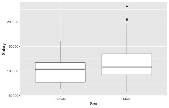
There is no consensus mathematical definition of an outlier. However, the boxplot (a Tukey invention) uses 1.5 and 3 times the interquartile range (Q3-Q1) from the edges of the quartiles to indicate an outlier. If the value of 25th percentile is Q1 and the value of the 75th percentile is Q3, then the interquartile range is Q3-Q1. In other words, an outlier would fall below Q1 - 1.5*(Q3-Q1) or above Q3+1.5*(Q3-Q1), and an especially deviant observation would fall 3 interquartile ranges above and below the relevant quartiles. If your data are normally distributed, you won’t see many outliers as defined by the boxplot, and any that you do see will usually be distributed approximately equally above and below the center of the distribution. Extreme outliers are often found in very skewed distributions.
The boxplots below show data from the ‘Salaries’ dataset in the Car package. Separate boxplots are used to represent the distributions of male and female faculty salaries. Outliers are represented in the graph in the male plot by dots above the ‘whisker’ or tail of the distribution. The distributions for both male and female faculty are positively skewed (note the longer whisker or tail above the box), but only the male distribution shows outliers in these data.
An outlier can have a large influence on the placement of the regression line if it belongs to one of the predictors. It may or may not lead to a gross misrepresentation of the data, depending on the placement of the point on the plot and the total number of observations. Ordinary regression models assume that the residuals are normally distributed, so serious skew can cause problems in inference because the p values for statistical tests in such models are based on the normal distribution.
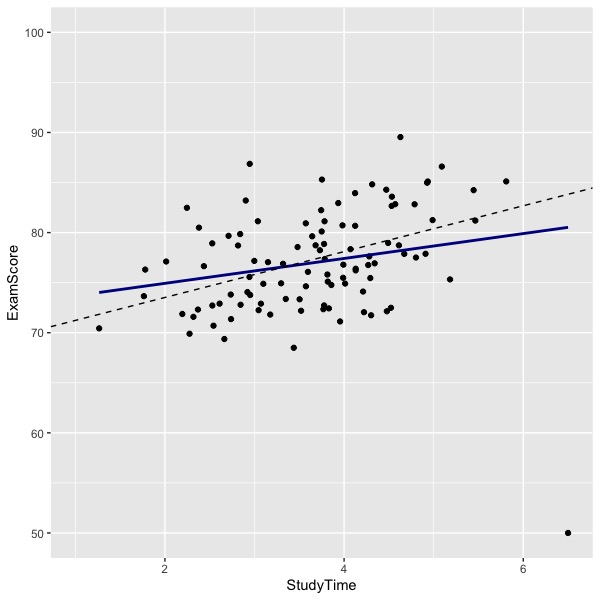
In the graph below, you can see that there an outlier at the bottom right of the graph. The solid blue line indicates the regression line computed by including the outlier. The dashed black line shows the regression line computed by eliminating the outlier. Note how the outlier has reduced the relations between study time and exam performance in these hypothetical data. The difference in lines (effect of the outlier) will depend upon the location of the outlier and the number of other data points.
Often times outliers are the result of some kind of error. Once upon a time it was common to use ‘-9’ as an indicator for missing data. In most cases, all of the rest of the observations would be positive numbers. I have seen analyses where the researcher forgot to tell the computer to treat -9 as missing, so the -9 values were included in the statistical tests. Needless to say, the results were erroneous. For a second example, once upon a time it was common to collect data using paper-and-pencil surveys and to use humans to copy the numbers from paper to computer. There were inevitable mistakes in coding, so for example, the value ‘9’ might be coded ‘99’ in the computer. If the legitimate values of the variable range from 1 to 9, the value 99 is going to be influential and the result of the analysis is going to be meaningfully wrong unless there are very many correctly coded observations to offset the error. Sometimes digits get transposed, machines lose calibration or break, datasets get merged incorrectly, or there may even be deliberate data falsification. Now that survey software is being used to collect data, transcription errors are quite rare. But errors in setting up the software are more common. The reverse coding of negatively worded items can be botched, the designation of the correct response to a multiple-choice item can be miskeyed, and software instruction files that have been edited to update the code may contain errors of oversight (e.g., an item that was reverse coded has been edited to avoid the negative stem, but the instruction to change the coding of the response from reverse to direct was overlooked). Investigate your outliers.
Sometimes there is no mistake (I think the salary data shown above really are skewed). Sometimes outliers are due to mixing populations. Perhaps the outlier in the graph regression graph showing study time and exam performance represents someone recently immigrated to the U.S. and for whom English was a second language, whereas all the rest of the students were native speakers of English.
Many of the diagnostics for influential data points such as outliers are based on analyses of residuals. Such diagnostics are described next.
Residuals
A residual is the difference between the actual score and the predicted score (distance on Y from the regression line).
Resid = Y – Y’
Defining the residual as the difference in this order (Y-Y’) assures that predictions above the line are positive and predictions below the line are negative. A residual is an error of prediction. The word ‘error’ has a bit of a pejorative meaning, so ‘residual’ is favored for is lack of same.
The mean of the residuals will be zero (unless there is a mistake somewhere in the calculations). The regression line is placed that way (by ordinary least squares), and the line is also placed so that the sum of squared residuals will be the minimum possible for the data as given. The standard deviation of the residuals tells essentially how far on average the observation is from the line.
SY.X = SDresid = standard deviation of the residuals.Standardized residuals
This quantity turns out to be useful in studying the fit of the data to the equation. The simplest thing we can do is to standardize the residuals by dividing each observed residual by SY.X. Doing so results in z-scores for the residuals (we don’t need to subtract the mean to get z-scores because the residuals are already centered at zero).

To find points that are discrepant or deviant, simply look for large values of zresid (some say |z| > 2 or >3). Statistics packages will allow you to save residuals and sort them by size. Or you can flag them if they are greater than some absolute value.
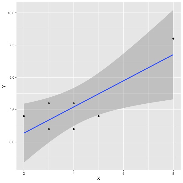
For the regression of exam scores on study time shown in the graph with the outlier, the R package lm shows the following regression results:
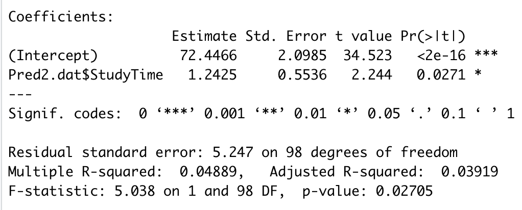
The residual standard error (5.247) is the standard deviation of the residuals when computed using the appropriate degrees of freedom (N-k-1 = 100-1-1 = 98 in this example). If we divide each observed residual by 5.247, we have the distribution of standardized residuals. The outlier in the graph has a standardized residual equal to -5.82, a very large number in absolute value. The next largest absolute value in these data is 2.16, which is less than 3. If you have lots of normally distributed data, you will have some flagged ( >2 or >3) standardized residuals. You may or may not want to delete them in your report. If I find suspicious data, I will analyze the data twice (with and without the suspicious data) and report both estimates. I will tell my readers what I’ve done and why so that they can judge the results for themselves. In this case, we find that the slope relating study time to exam score is positive and significant both with and without inclusion of the outlier.
Studentized residuals
The studentized residual adjusts the standard deviation of the residuals for each data point depending on the point’s distance from the mean of the predictor. The formula for the adjustment looks like this:

As you can see, we start with the standard deviation of the residuals (SY.X) and multiply that by a function of the number of observationss and the distance of the observation on X from the mean of X. The actual studentized residual is
You might recall from the prediction module that the error for the prediction interval is a close relative:

If you recall the prediction interval, the comparison might be helpful. Otherwise, ignore it and pay attention to the first of the two equations. Both are similar – they involve the standard deviation (or variance) of the residuals, number of observations, and a function of the distance of the observation from the mean.
Focusing on the standard error for the studentized residual (first of the two equations), the standard error first depends upon the standard deviation of the residuals – a large standard deviation increases the standard error. When we divide the residual by the standard error, we get a standardized residual (Zresid), so a larger standard deviation of residuals reduces the studentized residuals. The next thing that matters is the sample size, N. Small samples will lead to a smaller value of the standard error and thus larger studentized residuals. The last thing that matters is the distance from the mean. Larger distances from the mean lead to smaller standard errors and thus larger studentized residuals.
Now back to the prediction interval. The things that lead to a larger prediction interval lead to a smaller standard error for the studentized residuals because we add the adjustment for the prediction interval, but we subtract the adjustment for the studentized residual. However, the smaller standard error for the studentized residuals actually leads to larger studentized residuals because we divide the residual by the standard error. Thus, they both tend to push the item of interest away from the line as we depart from the predictor’s mean.
Leverage
You may recall sitting on a teeter-totter or see-saw as a child – or maybe even later.

Image credit: https://www.dreamstime.com/royalty-free-stock-image-teeter-totter-image8813396
The fulcrum – support or swivel point - in the teeter-totter corresponds to the mean of both X and Y for the regression line. In the cartoon, the heavier kid has the greater force and thus the lighter one is lifted off the ground. You might remember moving toward and away from the fulcrum in order to shift the balance and offset differences in weight to move your heavier (or lighter) friend up or down. Force on the seats depends both on weight and distance from the fulcrum.
The concept of leverage in regression is analogous in an approximate way. Weight is analogous to the inverse of the number of other observations in the regression (more observations mean less weight for any one observation), and distance from the fulcrum is analogous to distance from the mean on the predictor. Leverage indexes the impact of a point on the placement of the regression line. The formula is:

The alert reader will have noticed that leverage appears in the equations for both the prediction interval and the studentized residual. Again, you can think of leverage as an impact factor. People sometimes use leverage as a regression diagnostic. (I use other things to be described soon, but you need to know about this because it is in common use.) Some things to notice about leverage:
- • It’s a function of the independent variable(s) only
- • Large deviations from the mean are relatively influential
- • Maximum value is 1.0, minimum value is 1/N
- • Average value is (k+1)/N, where k is the number of predictors (X variables).
Packages that print regression diagnostics often include leverage as one of the columns of output. There is no absolute value of leverage that causes concern. Look for large values to check for problems.
Influence analysis – DFBETA and standardized DFBETA
Both visual inspection of the graph and analysis of residuals can identify observations worthy of investigation and perhaps deletion from the analysis. However, they do not immediately result in adjusted estimates of the slope(s) and intercept if you delete them. The DFBETA statistics do so directly, and thus immediately communicate the implications of deleting an observation, although the default (dfbetas) is to scale the change using a function of standard error of the parameter estimate and residual standard deviation. This means that you should look for large values of dfbeta (raw) or dfbetas (scaled). A toy example follows.
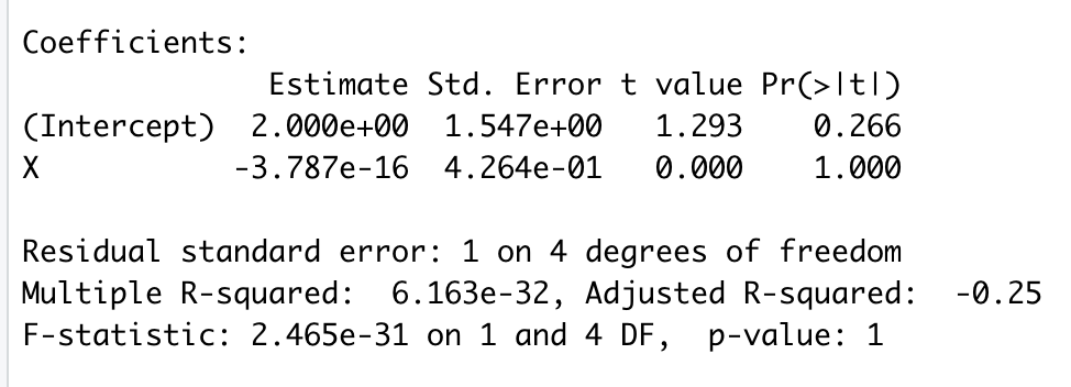
The main regression results are:
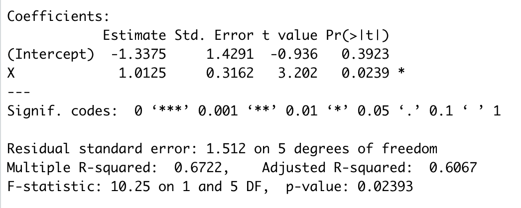
Note that the slope is 1.01 and the standard error of that estimate is .32. The positive slope appears due to one outlier in the top right. Of course, this is a toy dataset; in most circumstances you wouldn’t run a regression with seven observations. Let’s look at the influence statistics for these data:
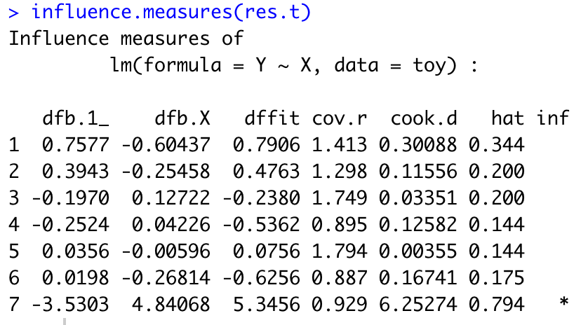
The value for dfb.1_ is for the change in the intercept, and dfb.X is the scaled change in the slope. Note that 4.84 is a whopper of a change. I’m not going to describe the remaining columns except to note that the ‘hat’ column refers to leverage as defined earlier.
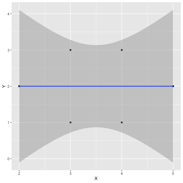
If we rerun the analysis without the 7th observation, we find the following plot:
And the following summary of results:
Note that the slope has moved from about one to zero. The value of dfb.X is 4.84, which results from a scaling that includes both the standard error of the slope in the initial sample and the standard deviation of the residuals in the sample with the observation deleted. If you want the difference in raw (unscaled) units, you may use the dfbeta() function in R. Doing so results in the following:
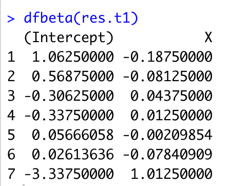
As you can see, we get the 1.01 difference in slope for X that which we expected if we delete the 7th observation.
The dfbeta (for the raw difference) is particularly useful if the slope has meaning in the original units. If we are predicting miles per gallon from horsepower of an engine, and the dfbeta is -.2, for example, then for each horsepower increase, we lose .2 miles per gallon if we delete this particular observation. If we have some critical value of mpg, then comparing dfbeta to this value could be helpful. Suppose we decide that anything less than .5mpg is trivial. Then we could examine all observations that resulted in a change of more than .5 in slope when deleted. On the other hand, often the slope does not have intuitive meaning (e.g., predicting job satisfaction scale scores from autonomy scale scores in an employee survey).
The important point is that the dfbeta shows the impact of removing the observation on the slope(s) and intercept directly, which usually corresponds to what you really want to know. Another good thing about the dfbeta diagnostic is that it will print out a value for each of the independent variables in the analysis, so you can consider the influence on each slope at a glance if you have multiple independent variables. This is the diagnostic I usually use (in addition to graphs) for considering observations to delete.
Review
What is a residual?
A residual is the difference between the observed value and the value predicted by the regression equation; it is the vertical difference between the individual point and the regression line in a scatterplot.
What are standardized and studentized residuals?
The simple residual will be reported in the original units of the dependent variable, whatever that is (job satisfaction, grade point average, miles per gallon, etc.). Dividing each residual by the standard error (standard deviation of residuals) results in z-scores, which always have the same metric and may be easier to interpret (e.g., absolute values greater than 3 are large). The studentized residual additionally considers the impact of the observation on the placement of the regression line and adjusts for the impact that each observation has in order to boost the residual for impactful observations.
What are dfbeta and dfbetas?
The dfbeta statistic shows the difference in the regression estimate (columns for intercept plus one or more slopes) that will obtain if each observation is deleted and the regression is re-estimated. The dfbeta statistic shows the difference in the original (raw) metric. The dfbetas statistic scales the observed difference (dfbeta) by a function of the errors in the original and reduced data analogous to scaling the residuals so that the scaled value may be easier to interpret.
Remedies for lack of fit
Fit Curves if needed. As you saw in the graph relating engine horsepower to gas mileage, the relations between the two are distinctly nonlinear. There are ways to use linear regression to fit curves instead of straight lines, and these can be employed to better represent the data. Doing so may solve problems of heteroscedasticity as well as bias in prediction if the curve does a good job of representing the data. I have a separate module on fitting curves.
Note heteroscedasticity for applied problems. If the relations are linear but heteroscedastic, then the average prediction will still be good, but the standard error will change depending on the value of the X variable(s). If your dataset is large, you can use it to find empirical standard errors at different values of the predictor. It may be possible to model the variation in error variance if there is an orderly progression (e.g., when money is the dependent variable, error variance may be a simple function of the predicted value).
Investigate all outliers. Correct any correctible errors (e.g., digit inversions). May delete the outliers or not, depending. Report your actions for transparency and to allow replication.
Collinearity
Collinearity is a condition that sometimes occurs with multiple predictors. If in a set of predictors, one or more predictors is completely or nearly completely predicted by the other independent variables, collinearity is said to be an issue. If collinearity occurs in a data set, the regression weights are poorly estimated. If any of the predictors is perfectly predicted by the set of other predictors, then the computer package will print an error, usually something like “the design matrix X’X has been deemed singular and cannot be inverted.”
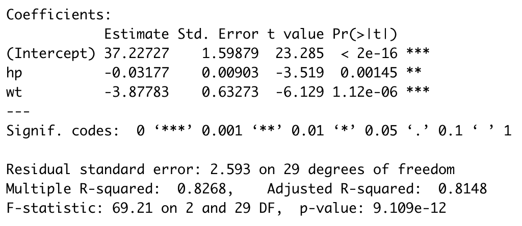
Using the mtcars dataset (nonlinear example), if we regress mpg on horsepower and weight, the regression result is:
For sake of illustration, I created a new variable called ‘wt2’ which is an exact duplicate of wt. Clearly, the correlation between wt and wt2 will be 1.0, and so each will be perfectly predicted by the other, thus resulting in collinearity. When I run the regression of mpg on both wt and wt2, I got the following:
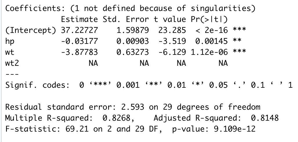
Note that there is an error message at the top noting ‘singularities’ and that the estimates for wt2 have been suppressed. Instead of estimates, we see ‘NA.’ If I changed the input to list wt2 before wt in the program, then wt would be suppressed and wt2 would be estimated. If you see this kind of output, fix the collinearity problem (in this case, drop wt2) and rerun. Many regression programs will not run at all if the design matrix is singular.
When I was a graduate student, I worked in the lab of Pat Smith, who developed a famous measure of job satisfaction. At one point, a bunch of us were arguing about the importance of facets of job satisfaction (e.g., work itself, pay, supervision, etc.) versus overall feelings of job satisfaction for predicting various outcomes like turnover (quitting the job). One of my fellows suggested that we run a regression where scores on each of the facet scales of job satisfaction would be a predictor. To this set, we should include as an additional predictor the score on the sum of all the facets, The sum of facets would represent overall job satisfaction. By running the regression, we would see the relative impact of the overall score and each of the facets in predicting the dependent variable, such as turnover. However, this was not going to work. The sum is perfectly predicted by the rest of the predictors, so we will have a singular matrix and the computer will not be able to do its work. As an aside, as I was leaving, Dr. Smith and company developed a ‘job in general’ scale to directly measure overall satisfaction. I’m sure somebody ran the regression including both the job in general scale and the facets, but alas, I don’t remember what they found. The point is that including the job in general scale might not present a collinearlty problem, but the sum of facets certainly would.
The ‘bouncing betas’
When we compute a regression equation, we estimate and interpret the regression coefficients. We might want to examine how well several individual differences (e.g., conscientiousness, cognitive ability, specific interest) predict grades in a given course (calculus, chemistry, or creative writing, for example). When we collect data and run the analysis, we would like to thing that the results are stable or consistent so that we would get similar results if we replicated the study. It turns out that not only are the standard errors of the regression weights larger when the predictors are correlated, but also the estimates themselves become correlated. One way to think about it is that the predictors fight for variance in the criterion. When the predictors are correlated, there is shared criterion variance between them. If one of the predictors grabs that shared variance, there is little left for the other. What this means is that over repeated replications give (correlated predictors), when one b-weight is large, the other will be small, and thus the estimates will be negatively correlated. This state of affairs is shown in the diagrams below, where a computer simulation was run for 500 trials, each with N=100 observations. In the first simulation, there is no correlation between predictors, and thus there is no correlation among the regression estimates over trials (i.e., the estimated weights are independent).
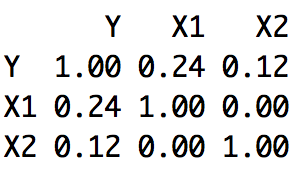
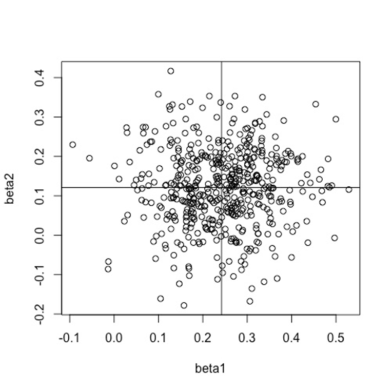
Notice that the means of the betas are about .12 and .24, as you would expect from the correlations.
However, if we run the same example, except that we move the correlation among the predictors from 0 to .90, then we find
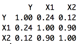
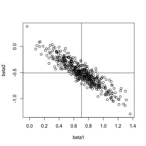
Two things are noteworthy here. Most importantly, there is a large, negative correlation among the betas. When one is large, the other is usually small. Thus, over trials, the betas ‘bounce’ or move up and down. This means that it is hard to know the actual value in the population and we may well be misled by the relative size of the betas we observe on any given replication. The second thing to notice is that the average of the betas is no longer .12 and .24. Instead, we have mean values of approximately -.5 an d .7, which are quite different than what we might expect from only knowing the correlation of each predictor and the criterion without knowing the correlation between the predictors. Collinearity makes it difficult to interpret the regression weights.
Collinearity Diagnostics
Of course, we can inspect the correlations among our predictors for large correlations. If we see correlations of .8, .9, or even higher, we need not go further to know that there’s a problem. But collinearity is possible even with smaller correlations among the predictors. For example, several relatively uncorrelated predictors might be summed, and even though the sum is not very highly correlated with any single predictor, it is perfectly predicted by the set. There are several regression diagnostic indices that are often used and reported by researchers. We will describe the variance inflation factor, tolerance, and the condition index.
Variance Inflation Factor (VIF)
The VIF is an index that describes how the correlation among the predictors increases or inflates the standard error of the regression coefficient. If we have two predictors, the standard error of the regression weight for the first predictor is:

Where the term in the numerator is the variance of the residuals, and in the denominator we have the sum of squares for the first predictor and then one minus the squared correlation between the predictors. If we unpack this a little, the standard error of the regression weight is large when the variance of residuals is large. The better we can predict the criterion, the better we can estimate the regression weight. The standard error gets smaller when the sum of squares for the predictor is large. If we have a small range for the predictor, it is harder to estimate the slope accurately. And finally, the standard error becomes larger when the correlation between predictors is large. As the squared correlation between predictors approaches 1.0, the term on the right of the denominator approaches zero, and the standard error becomes infinitely large. If the correlation between predictors is zero, then the term on the right of the denominator becomes 1.0, and effectively drops out of the equation.
We can rewrite the equation (as a variance this time) by:

The term on the far right is the variance inflation factor. It shows how much the variance of the estimated regression weight is increased or inflated by the squared correlation between the predictors. Its minimum value will be 1.0. It can be indefinitely large. Although there is no absolute criterion for its evaluation, some say a value of 10 or more suggests a serious problem.
When there are any number of predictors (not just two), we can write the equations for the standard error as:

As you can see, we are still referring to the standard error of the first predictor. The quantity in the numerator is still the variance of the residuals and the term on the left in the denominator is still the sum of squares for the first predictor. The term on the bottom right is one minus the squared correlation of the first predictor when it is predicted by the remaining predictors. So if we had three predictors, the term would refer to R2 where IV 1 is predicted by IVs 2 and 3. To find the variance inflation factors for the other predictors, we would need to find the sums of squares for each, and to treat each as a dependent variable in turn, using the remaining predictors as the independent variables (the variance of the residuals is constant for all these).
We can shorten the notation of the VIF to

Or

In each case, the VIF indexes how much the variance of error increases because of correlations among the set of predictors. If we had computed the sum of several uncorrelated variables and entered both the sum and constituents into a regression program, we would get an error of some kind. The VIF for the summed variable would be infinite because R2 for the summed variable would be 1.0. Look for large values of the VIF as indicators of problems.
Tolerance
Tolerance is the inverse of the VIF:
Small values of tolerance are trouble, just as large values of the VIF are trouble. Some regression computer programs will print a warning about one or more small tolerance values, and equation above refers to the quantity about which they complain. So if you see a warning about tolerance values, think collinearity in the predictor matrix and start wondering why it’s there.
Condition Index
The condition index is a modern diagnostic that examines the entire predictor matrix at once. It is a little more difficult to understand, but it’s just as easy to use as the other diagnostics. It’s easiest to understand by looking at an example. The table below refers to a regression problem where we have three independent variables, plus the intercept – the design matrix.
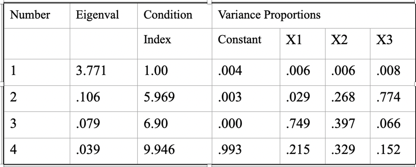
In multivariate statistics, there are a number of matrix operations that are useful in data reduction. One of these computes linear combinations of the variables such that the first combination has the maximum variance possible (subject to a constraint not relevant here), the second combination has the maximum variance possible subject to being uncorrelated with the first, and so forth, until all the variables have been exhausted. The variances of such linear combinations are called eigenvalues. As you can see in the table above, the first eigenvalue was 3.771, the second was .106, and so forth. The condition index (third colum) is computed by dividing the maximum eigenvalue by the eigenvalue in that row, and then taking the square root.

Here the Greek letter lambda stands for the eigenvalue. So for the first condition index, we have sqrt(3.771/3.771) = 1; for the second we have sqrt(3.771/.106) = 5.97, and so forth. To use the condition index as a diagnostic, we first examine the condition indices. Again there are no formal criteria for evaluation, but 30 is considered a sign of a serious problem, and 15 is considered worthy of inspection. If we find condition indices as large as 15 or so, we will then look to the columns for proportions of variance. These latter columns indicate how closely associated each of the variables are with the particular linear combination. If we find two or more that are at least .50, then we have spotted a problem. In this first table, we don’t have any condition indices larger than 15, and in none of the rows are there two or more variables with proportions greater than .50. Thus the table above shows a regression problem with no apparent collinearity issues.
However, let’s examine another example.
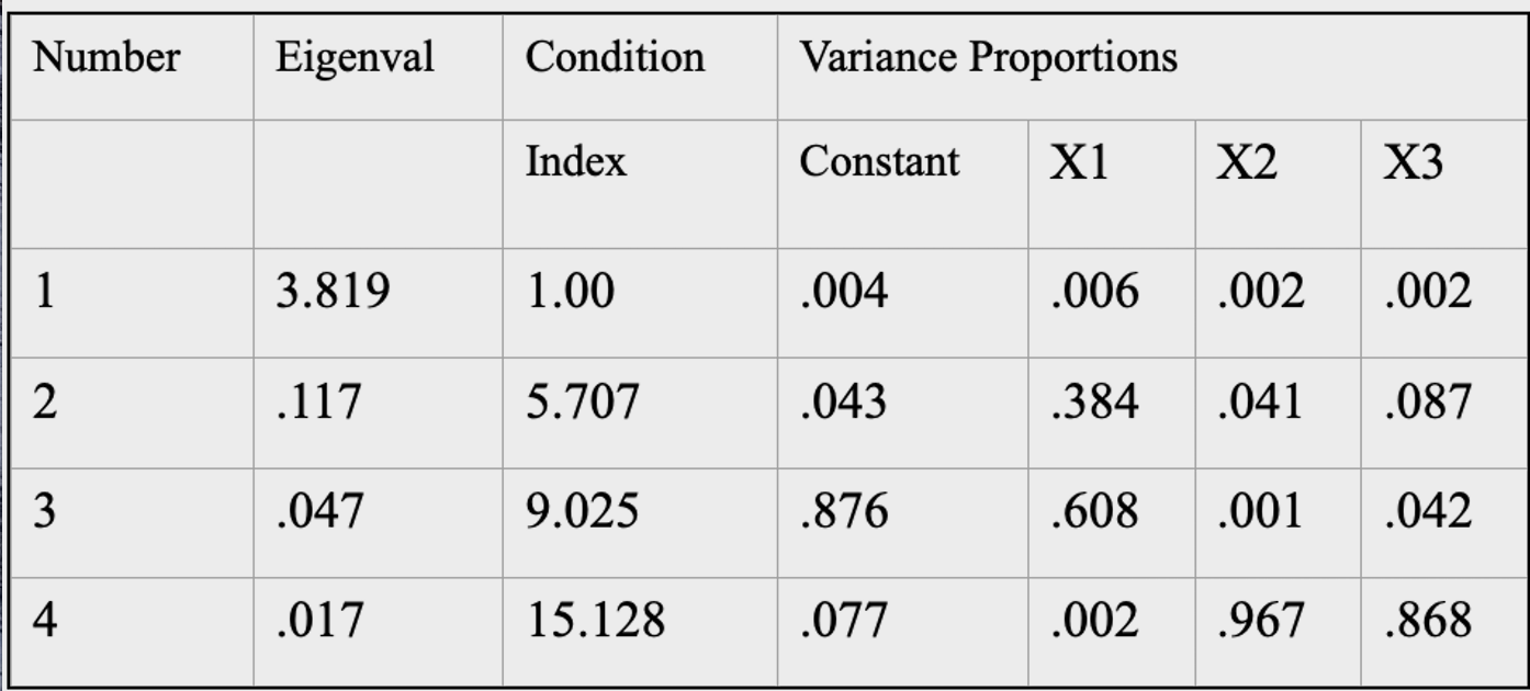
In this example, the fourth condition index is larger than 15, indicating a potential problem. Further, two of the variables (X2 and X3) have variance proportions greater than .50. It is likely that the coefficients for variables 2 and 3 will be poorly estimated. To recapitulate, to find a collinearity problem in your data, look for a large condition index with two or more variables showing large variance proportions. If you find that, you have a problem.
What to do about collinearity
Report it. At the very least, you should report that you have a collinearity issue. If the sole point of the regression is prediction and you do not care about how well the individual regression weights are estimated, then collinearity is not that important for your inference. If you had a bunch of cognitive ability measures and you wanted to predict success on some puzzle solving task for example, then you wouldn’t care much about the relative contributions of each of the measures. On the other hand, you would be wasting time and effort in collecting a bunch of measures of the same thing. And if collinearity is severe (as when the sum of variables is added to the regression equation along with its constituent elements), the results may be erroneous as we saw in the example where I included the sum.
Select or combine variables. Sometimes we have more or less deliberately included measures of the same construct in our data collection. In such cases, we can select one of the redundant variables (perhaps the less expensive or time-consuming one) to remain in the regression. I wouldn’t assume that the variable with the largest regression weight before selecting or combining is necessarily the better choice. Recall the problem of the bouncing betas. We can also simply add the redundant variables together and treat the sum as the predictor rather than including either of the original variables. Doing so will increase the reliability of the variable which is the resulting sum while eliminating the correlation among those two predictors. Either of these options is usually a good one.
There are several other avenues that you might travel, but they are usually less desirable.
Factor analyze the predictors. Factor analysis or principal components analysis will generate linear combinations of the original variables that are uncorrelated. Although the new variables will have desirable statistical properties (i.e., they have little or no correlation among them), they are no longer the original variables, but rather combinations of them. Such a result can make the interpretation of the resulting regression coefficients more difficult. You may have exchanged one problem for another.
There are analyses designed for large correlations. Path analysis can decompose large correlations into direct and indirect effects by considering sequential subsets of variables and thus avoiding some of the collinearity issues. But you need hypothesized causal relations among the variables in order to use path analysis. Ridge regression is another kind of regression that is intended to handle collinearity problems. But that is beyond the scope of this article.
If you are worried about the quality of the estimation of the weights (large standard errors), you can avoid estimation all together by using unit weights or by supplying your own weights that were derived in some earlier, independent analysis. However, at this point you are no longer doing regression, and people are not very good at guessing the best regression weights.
Review
What is collinearity?
Collinearity is the condition in which one or more independent variables are perfectly predictable or nearly so from the other independent variables.
Why is collinearity a problem?
Collinearity results in poorly estimated regression coefficients (the bouncing betas). Standard errors for the coefficients become large, which results in poor statistical power for tests of statistical significance for the coefficients.
What are some ways you can detect collinearity (describe VIF, tolerance, the condition index)?
The variance inflation factor is 1/(1-R2) where R2 is the variance in the independent variable of interest that is accounted for by the rest of the independent variables. It indicates the inflation of the error variance for the regression coefficient of variable of interest. Tolerance is the reciprocal of the variance inflation factor, that is tolerance = 1/VIF. The condition index is a modern diagnostic that provides information about whether or not there appears to be a problem, and if there is, which variables appear to be affected.
What are some things you can do if your dataset is collinear?
You can drop redundant independent variables or add correlated independent variables together, factor analyze the data, or resort to non-traditional means of analysis (e.g., ridge regression, path analysis, or supply your own weights).
References
Pedhazur, E. J. (1997). Multiple regression in behavioral research. Fort Worth, TX: Harcourt Brace.